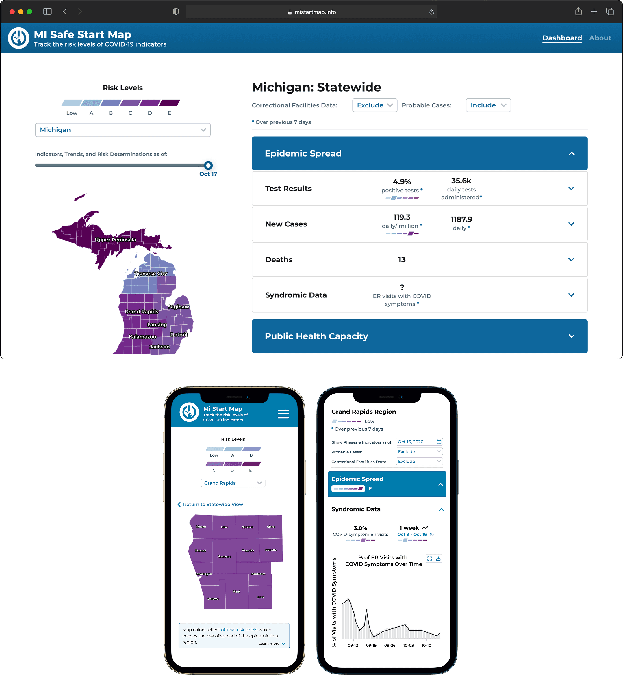
The COVID dashboard for Michigan.
A public-health dashboard commissioned by the State of Michigan and built with UMSI and UMSPH — serving state officials and 200K monthly visitors from May 2020 through April 2024.
I The problem
The State of Michigan needed a data-backed resource to decide whether to initiate statewide re-opening procedures or reinstate shutdowns during COVID-19. Because the pandemic moved fast, there was no time to deeply explore the problem space — we gathered requirements directly with the Michigan Department of Health and Human Services (MDHHS) and prioritized shipping quickly.
The result was two distinct dashboard versions serving two completely different audiences:
- Private: government officials and public health experts making rapid reopening decisions
- Public: the general public trying to understand what those decisions meant for their county
II Research
Private user tests & interviews
Once a closed-beta private version launched, we ran user tests and interviews with public health workers and government employees. Sessions included a pre-test questionnaire for device and professional context, structured task walkthroughs, and a debrief on usability priorities. Key findings:
- Regional and county-level data granularity was insufficient
- Officials needed downloadable raw datasets to run independent analysis
- Data had to be digestible for staff who didn’t work with COVID data daily
Public user tests & interviews
Roughly two months after the public launch, we ran a second round — empathetic semi-structured interviews to build rapport, followed by task walkthroughs and open-ended feedback. Key findings:
- The timeline slider was not perceived as interactive
- Users anchored heavily to the detailed graph rather than the map
- The mobile version was effectively unusable
- Trust and transparency of published data were the primary public concern
- Hospital capacity was a top anxiety point due to fears around availability
Cognitive walkthrough
By September I was one of two designers remaining on the team. Without the resources for another full user research cycle, I conducted an expert-user cognitive walkthrough — putting myself in the shoes of a general public user completing a typical task (finding the current COVID state for Washtenaw County) while thinking aloud. The goal was to surface functional usability issues that previous iterations had deprioritized in favor of feature delivery. Findings were ranked and handed off directly to developers.
III Design
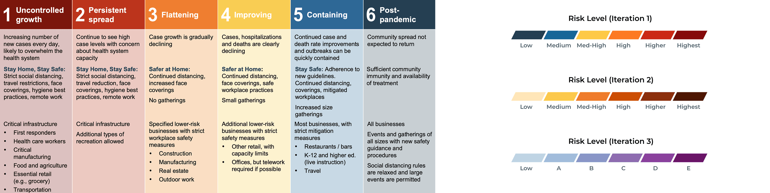
Color — three iterations
Color was the most contested design decision across the project’s lifespan.
Iteration 1 used Governor Whitmer’s official reopening phase colors by state mandate. The problem: a region with low case counts early in the pandemic would inherit the “post-pandemic” color, which was critically misleading regardless of actual risk. This version ran live for several months.
Iteration 2 moved to a monochromatic scheme with no ties to the reopening plan. Our primary state health department stakeholder flagged that the red tones communicated too much fear and danger to the public health community. It was never released.
Iteration 3 — the version that shipped and stayed live — used a cooler palette and replaced the Medium / High / Highest labels with A through F, eliminating the reopening phase association entirely while communicating risk level clearly.
Iconography — nine CDC case trends
The private dashboard required unique icons mapping to CDC case trend definitions — highly specialized language that had to be broken into immediately recognizable symbols. Public health stakeholders also required icons for low-falling trends: no cases ever, no cases in two weeks, and fewer than five new cases in two weeks. That brought the total to nine distinct case trends.
With only six risk levels to map against nine trends, I worked with stakeholders to consolidate overlapping CDC definitions and group all low-falling trends under the “Low” risk level — reducing icon count without losing clinical precision.
IV Outcome
Live from May 2020 through April 2024. Over 200K monthly unique visitors at peak. Covered in a Governor Whitmer press release, Fox17, WILX10, and a University of Michigan news feature. The dashboard directly informed state-level public health decisions throughout Michigan’s pandemic response.