The card shopping experience, reimagined.
Redesigning the product selector component, product content, and comparison feature to set the stage for Capital One’s unified card shopping platform.
I The problems
Prospective Capital One customers encountered three distinct failure points across the same funnel. On the homepage, a ~95% non-engaged dropdown left users without enough product knowledge to move forward. On the browse page, dense card descriptions made the catalog exhausting to scroll, with nothing to help users quickly distinguish one card from another. On the comparison feature, broken mobile hierarchy and missing pre-approval paths left conversion on the table at the exact moment intent was highest.
The opportunity to fix the highest-trafficking credit card homepage's selector component alone could lift new account bookings by 5%, worth roughly $14M annualized.
The other two workstreams set the platform up to convert better in comparison experiences, setting the stage for a modernized credit card shopping experience and maximizing new credit card accounts booked for the business.
Homepage
- Card-category dropdown had ~95% non-engagement
- Users lacked enough product knowledge to move forward with an application
- The business fails to connect potential customers to the right information and landing points
Comparison Page
- Card descriptions were long and dense paragraphs
- Scrolling the full catalog was exhausting, one product took up the entire vertical viewport
- The business fails to help customers quickly understand credit cards
Comparison Feature
- No visual hierarchy on mobile; misaligned columns in the scrolled view
- Ambiguous labels and no pre-approval path despite Capital One actively pushing to make more cards pre-approvable
- The business fails to help customers differentiate credit cards
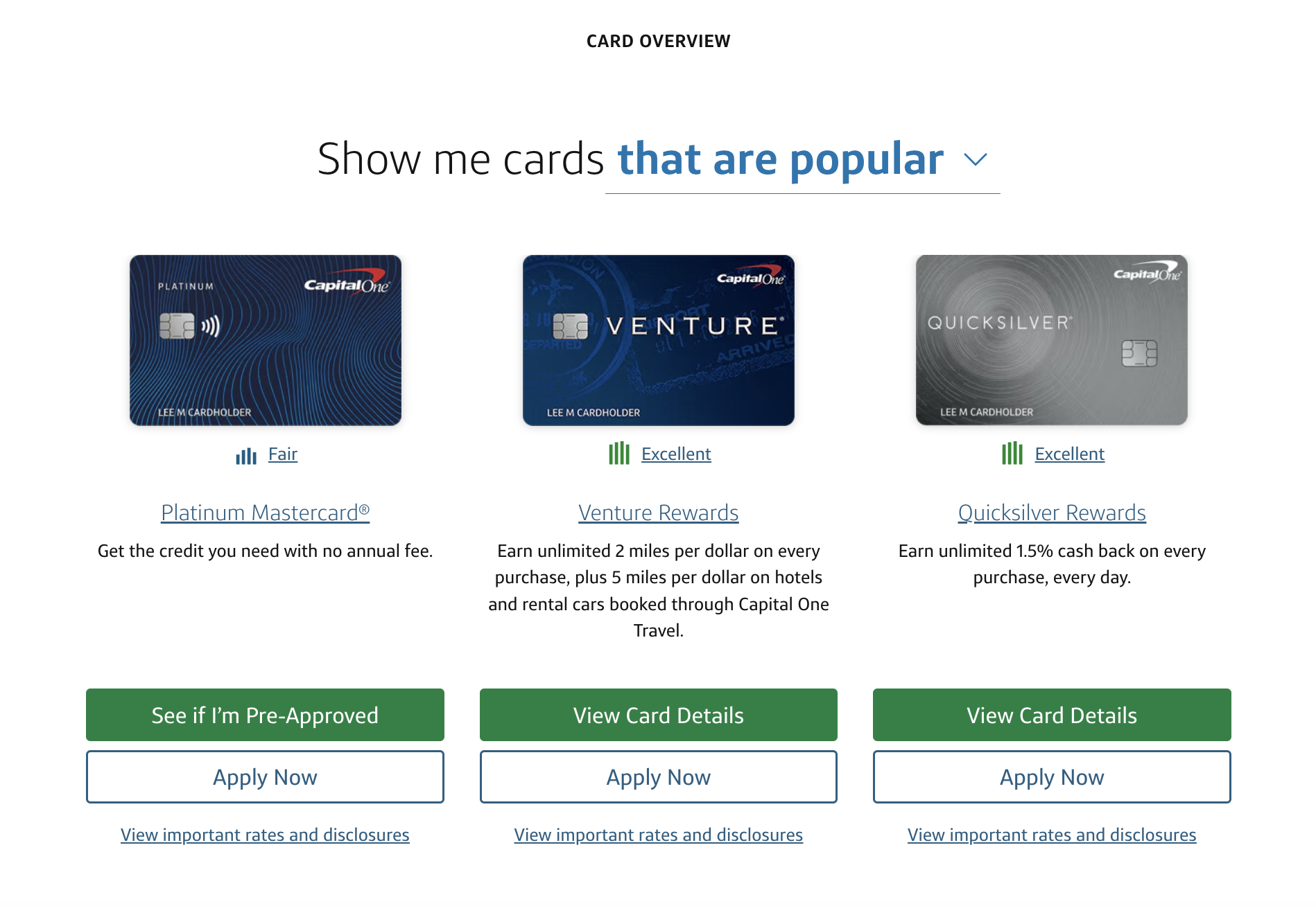
01 Product Selector
Audits before variants
Two audits framed the work — a visual design audit flagging alignment issues in CTAs, and a communication design audit focused on visual signifiers: what users thought was clickable, and what actually was.
Competitive analysis
Competitors collapsed the same job-to-be-done into a single tap where Capital One required two — open the dropdown, then select. That gap defined the solution space.
Ten+ variants, eight tested live
I produced 10+ rapid variant designs including a ghost-button prototype for market testing. Eight ran as live experiments on the Capital One site.
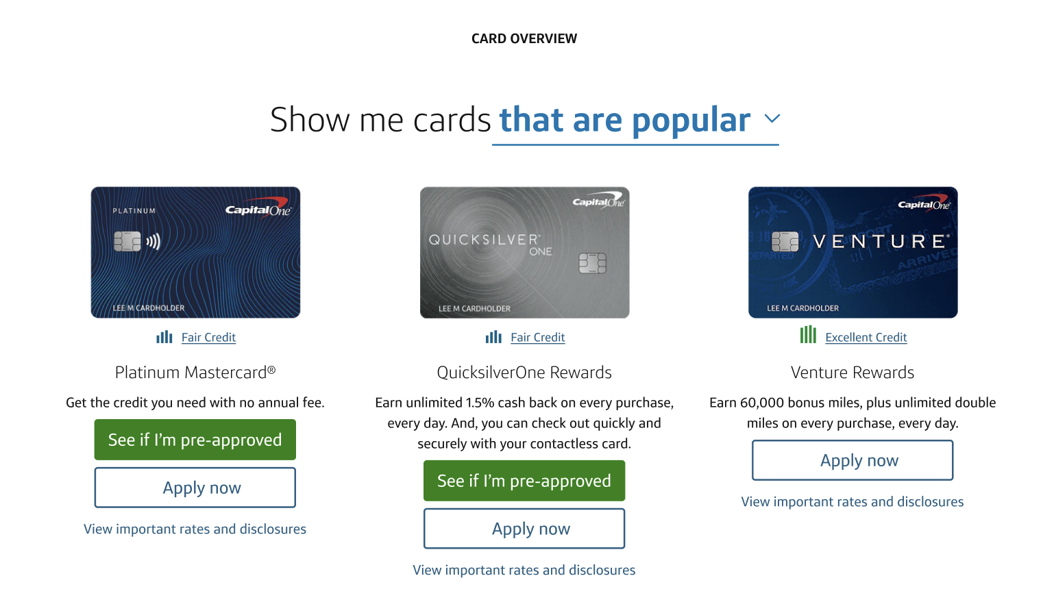
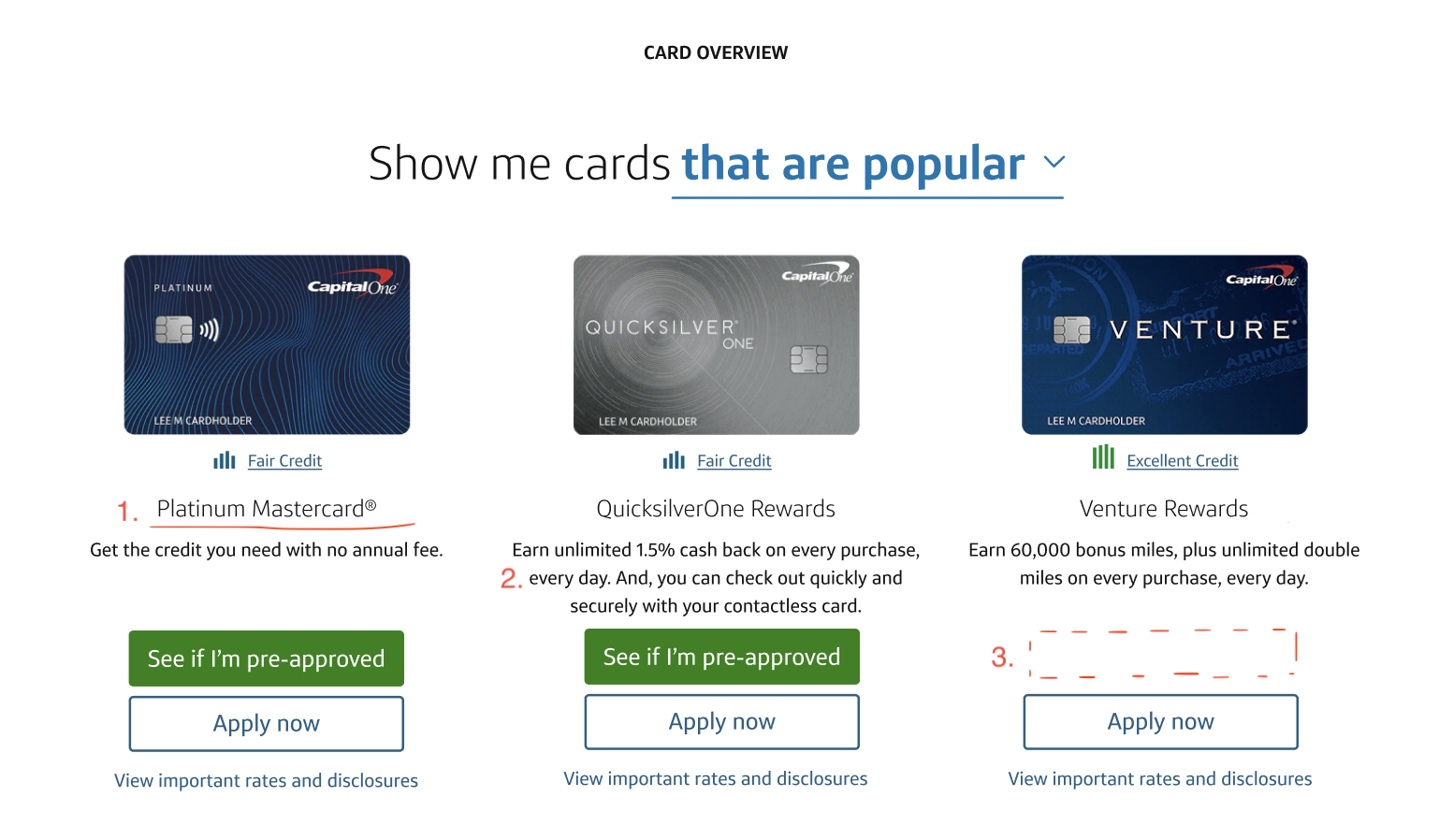
The winning variant
Three changes carried the lift:
- Swapped the set of card products surfaced by default
- Underlined product text-links to signify the ability to learn more
- Added a “View Card Details” CTA for products the user wasn’t eligible for
The dropdown itself was retained — the fix was framing and signifiers, not component-level replacement.
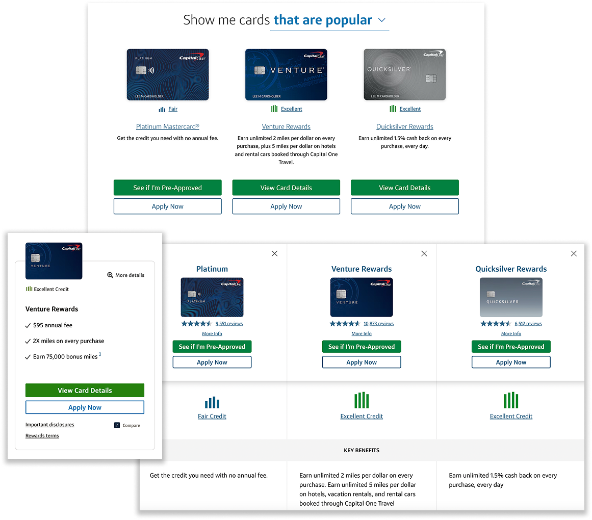
02 Content
Concurrently, I pushed for simplified bulleted-language as opposed to paragraph-driven content design on the card comparison page. Too much information, presented without hierarchy, dramatically hurt readability and comparability.
Each card carried a wall of bullet points: APR ranges, transfer fees, rewards rates — all given equal visual weight. The browse experience demanded reading work before users could compare anything.
To make matters worse, customers across all platforms could barely see any content above the fold upon page load.
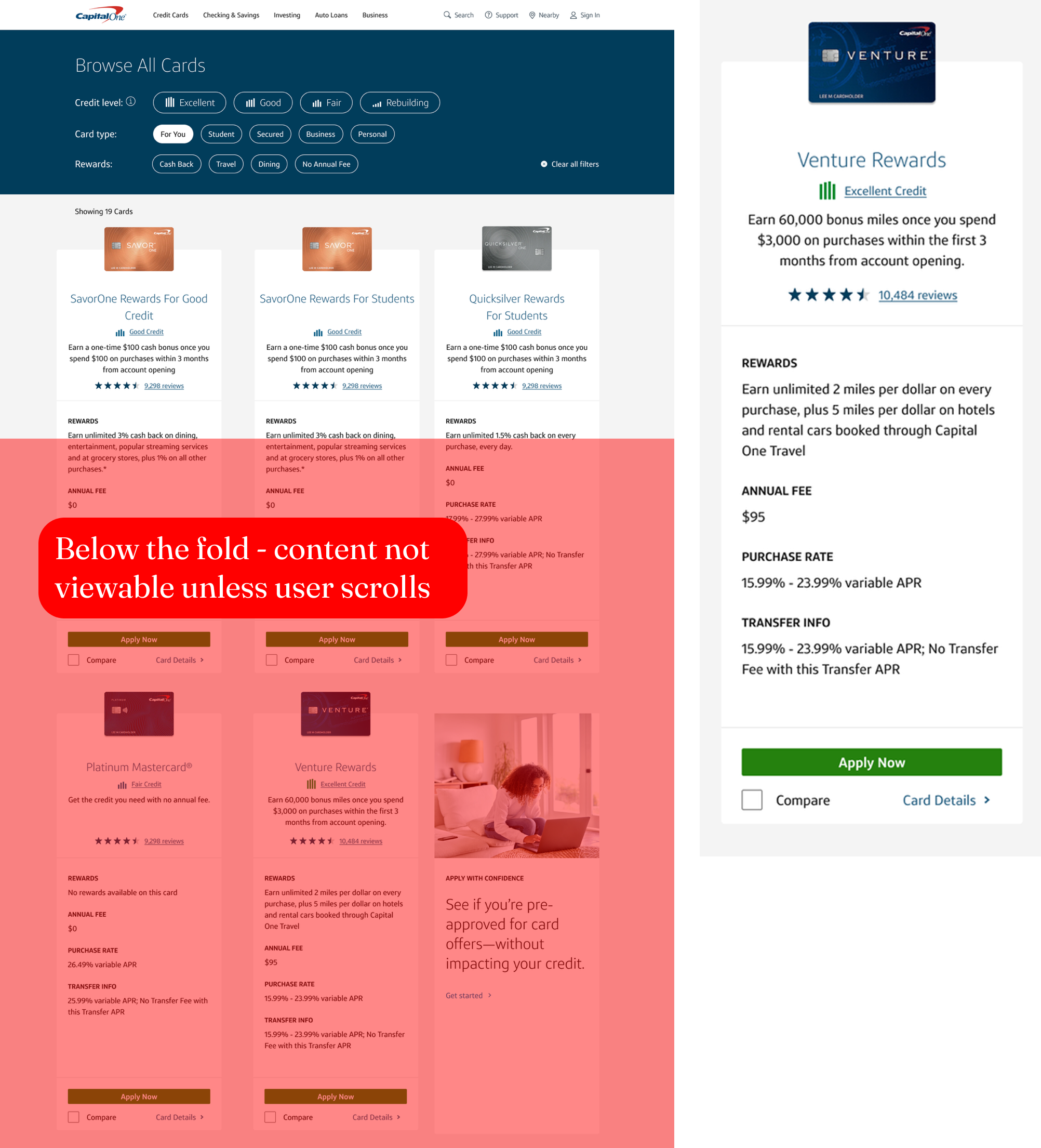
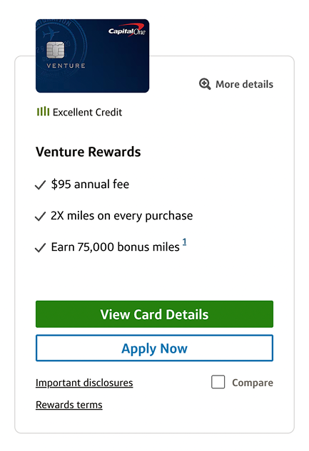
The redesign distilled each card to its key product value proposition — one or two benefit statements that answered “why this card” without requiring the user to parse full terms. This reduced the vertical footprint of each card significantly, making the catalog scannable in a way the dense format never was. More granular details were tucked behind "More Details".
This was also a prerequisite for the eventual combination of the homepage and comparison page that followed years later.
03 Comparison Feature
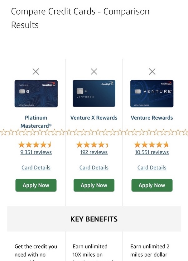
I led a full information architecture audit of the comparison feature across mobile, tablet, and desktop. The existing mobile experience had no structure:
- Infinite star bug
- Card names sat below card art, even though the name was the primary identifier
- The X dismiss button was unnaturally centered and easy to miss
- A generic “Card Details” link made the destination unclear
- Only one CTA appeared where both apply and pre-approval paths were needed
- In the scrolled sticky view, column dividers didn’t align with the benefit rows below them
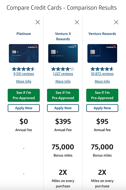
Every change was deliberate:
- X moved to the top-right corner of each card slot — consistent with dismiss conventions and easier to reach on mobile
- Card name moved above card art — the name is the primary identifier; art supports, not leads
- “Card Details” relabeled to “More Info” — a clearer signal that this link opens the full card product page, not a tooltip or modal
- Pre-approval CTA added alongside “Apply Now” — “See if I’m Pre-Approved” (later “Check My Eligibility”) lets users gauge approval likelihood with no credit score impact
The pre-approval addition was the most strategically significant. Capital One was actively pushing to make more cards pre-approvable, and surfacing that path at the comparison step — where intent is highest — directly supported that initiative. It removed the credit-score risk that caused users to abandon rather than apply.
Outcome
+4.7% new accounts booked. +$14.7M annualized revenue from the product selector component alone. The product selector design had remained live until 2026.
The content overhaul and comparison redesign were qualitative contributions that were structurally necessary to the broader strategy of modernized shopping. They reduced friction in browsing and decision-making that the selector alone could not address.
These overhauls eventually enabled the always-on comparison experience. After I rotated off the team, the Credit Card Homepage and Card Comparison Page were combined, and can be viewed at capitalone.com/credit-cards today.