Bank Apply, refreshed.
Modernized the account opening UI and enabled dark mode for 2.2M annual banking customers. Cut code by 90%, updated an outdated design system, and reduced experimentation cycles from months to weeks.
I The problem
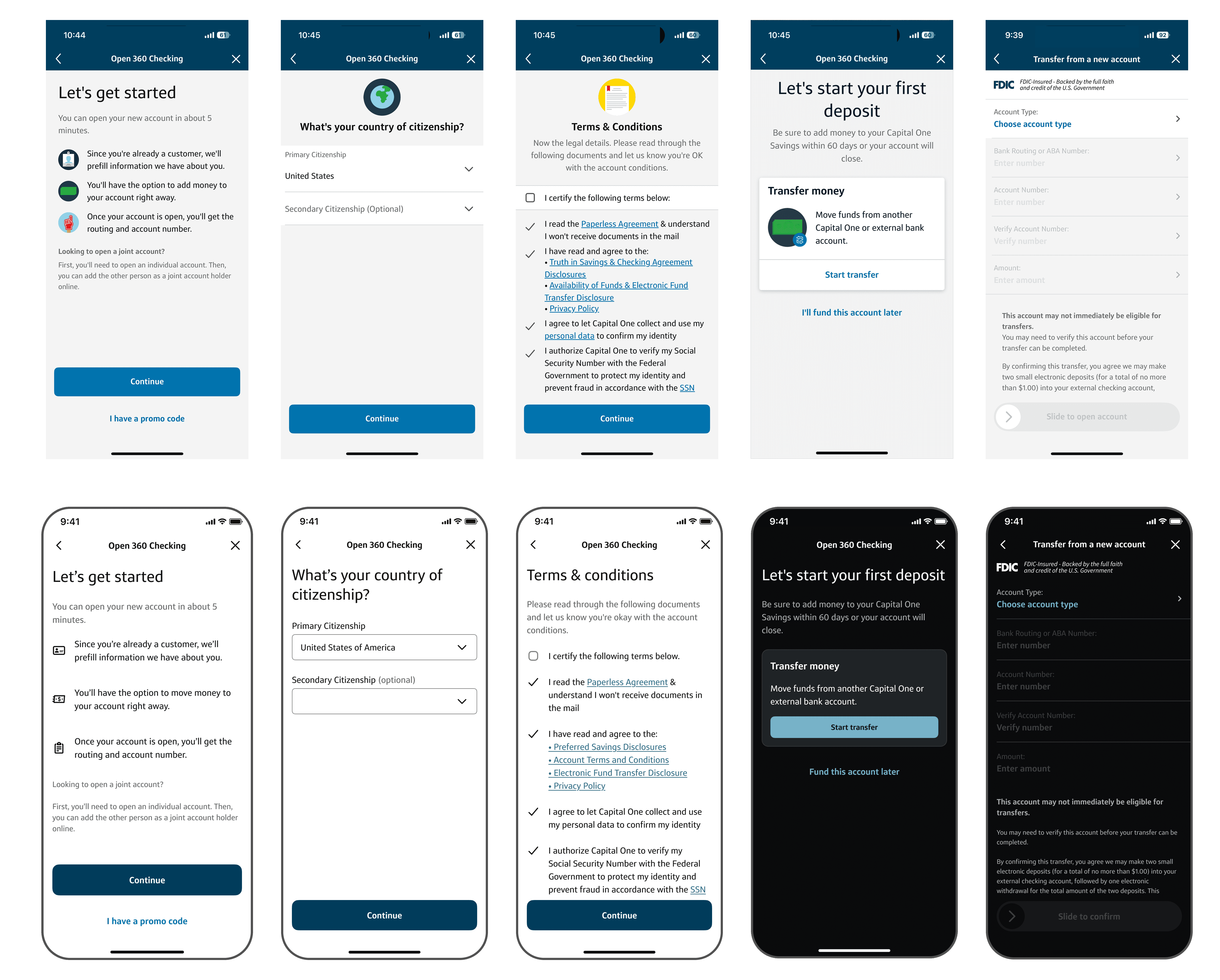
First, the existing account-opening flow risked missing an enterprise modernization deadline to utilize 100% design system componentry. Consequently, once Capital One globally enabled dark mode across the entire app, the legacy flow would render with illegible and inaccessible text. This puts us at risk of violating the Americans with Disabilities Act.
The stakes: Existing customers simply wouldn't be able to open a new bank account within the app. They wouldn't be able to read anything or progress, and the business would lose potentially millions of deposits.
II Approach
Conceptual framework
I led the technical framing for implementing experience modernization at the local portfolio level for bank account opening. Capital One Account Opening's future CMS architecture depended on content alignment across all platforms, including Native app, mobile, and desktop Web. This unlocks dynamic content editable within the CMS without requiring engineering involvement for every change.
With hardcoded styles in the codebase, the architecture would only work if the
underlying UI is modular and token-driven. I tied the architectural
requirement directly to the enterprise modernization push, making that combined case
across local teams and the broader organization.
Eliminating the illustrations
wasn't an aesthetic call. It was a prerequisite to faster content editing
and, subsequently, testing. This discussion turned a deadline-driven
requirement into a foundational dynamic platform we can build on past 2025.
Hardcoded
- Partially-siloed from enterprise components due to abundance of custom implementation
- Outdated illustrations per screen
- Styles locked to each release
Experience Modernization
- Enterprise Token-driven, modular components from design system
- Minimalist design aligned across Native, mobile & web
- CMS-ready architecture
CMS-Driven
- Instant content edits via CMS (editable by non-technical users), engineering no longer needed for small changes
- Supports rapid, lightweight testing
Cross-functional partnership
I served as the primary communication bridge across five distinct stakeholder groups: local product, local tech, local design leadership, the enterprise design team, and enterprise developers. Each group had different constraints and vocabulary, and I translated intent between all groups, aligning on decisions that held up across every layer. Most importantly, I got SUPER close with the local tech team.
That alignment and approval from product leadership is enabled the 90% reduction in code. I served as a champion for tech resources- identifying shared components that other teams owned, and diverted responsibility for contributing custom implementation back to the design system. This reduced local tech effort and eliminated duplicate work for our engineers.
I also shared product responsibility, writing stories and defining the work at the execution level to keep delivery moving across teams.

I communicated across 50+ teammates and 4 cross-functional leaders in order to clear up confusion and clarify scope, pushing the work forward.
Key design decisions
- Eliminate excessive illustrations to support future CMS architecture
- Minimize styling: flexibility over decoration
- Portfolio-level thinking over siloed, screen-by-screen fixes
Execution
While all of that alignment work was happening, I was building. Every screen went through Figma at pixel-perfect fidelity, reviewed and signed off by design leadership before anything reached engineering.
Before any of this was possible, leadership's primary concern was tech resourcing. There was no committed engineering path. Early on, I worked with my manager to scope the initial discovery work and led the pitch to product that secured it. Without that, the project never gets off the ground.
III Outcome
Shipped to 2.2M annual banking customers. Dark mode rendered accessibly; the refreshed UI unblocked the enterprise modernization deadline; downstream experimentation cycles shortened from months to weeks.
If you're a current Capital One customer, you can see the new designs by opening a new bank account in the app today.